Promotions generat lots of registrations for the website, but only very little active users. This is due to:
Promoter/consumer sales conversation is stiff and linear and too product focused.
Community does not have enough to offer.
Registrations are not activated at the POS.
Idea
We will integrate a token system. The tokens will represent a reward system for the user, that can be tied to any activation or data survey. They are redeemable for goodies, which are branded lifestyle products, not necessarily related to the Winston product line. The tokens can only be earned, not bought.
Concept
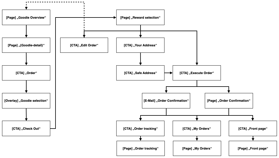
Processes
Check Out
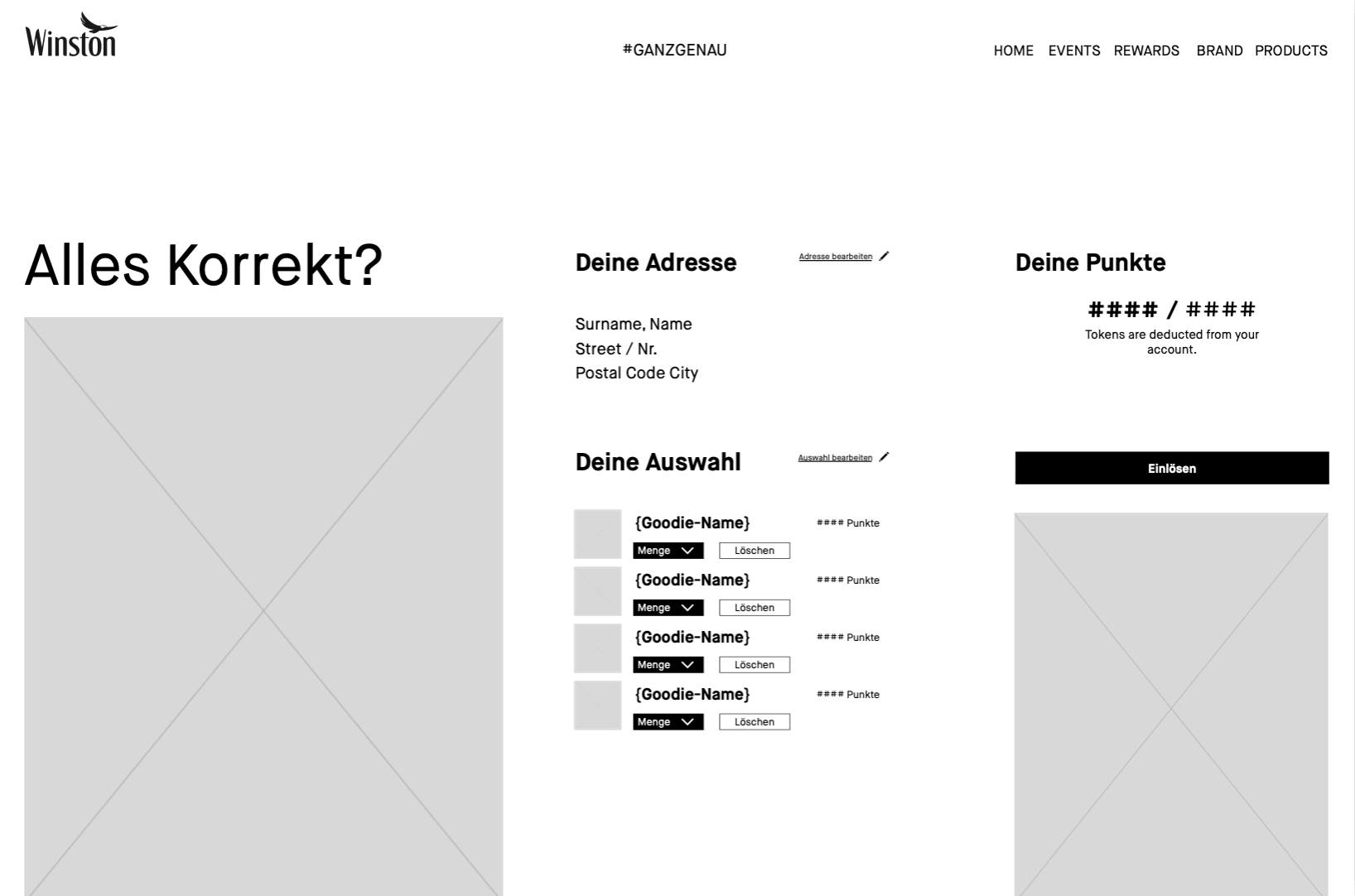
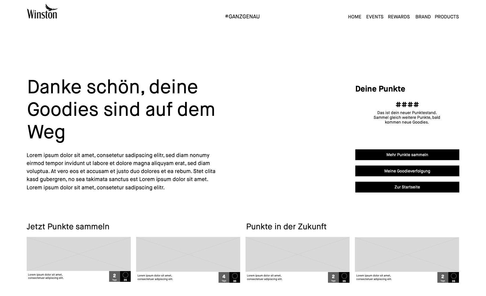
After the user has put a goodie into the basket, they get to the page to check their address, their order and then execute their order. After the their confirmation they can check the tracking, their orders or go back to the front page.
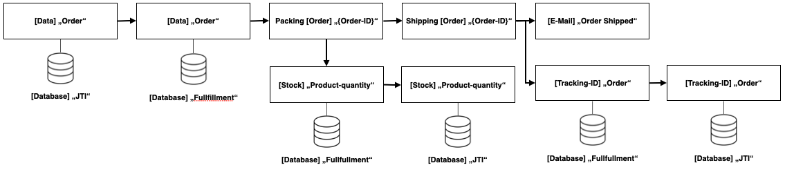
Shipment
The most crucial part is the communication and data flow between the contractor and us.
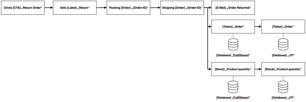
Return
Development will think of the return process while building the token system, so it is easier to implement at a later token. But we will not implement it in this step. So if user want to return something, they have to contact us via email.
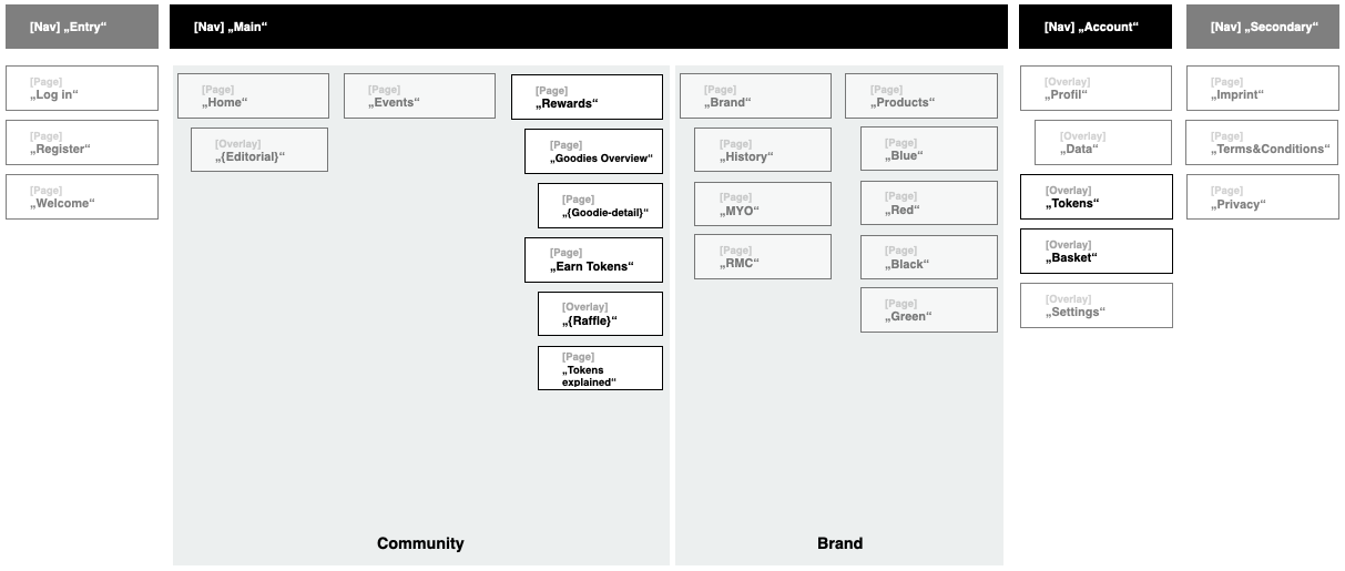
Structure
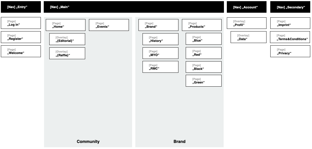
From the processes written we knew, that we need to add the pages:
Rewards
Goodies Overview
Goodie Detail
Earn Tokens
Raffle
Tokens explained
Userflow via Wireframes
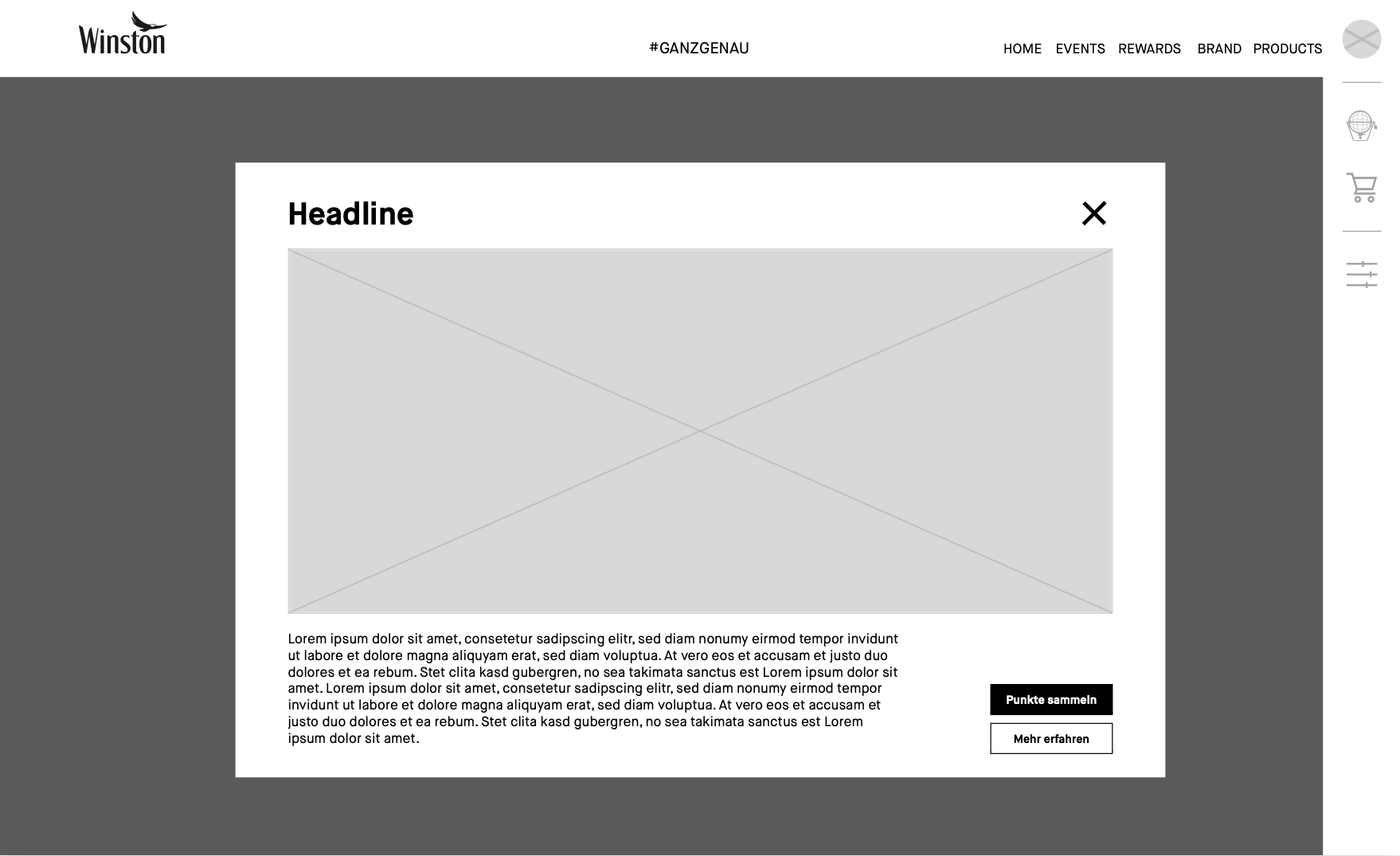
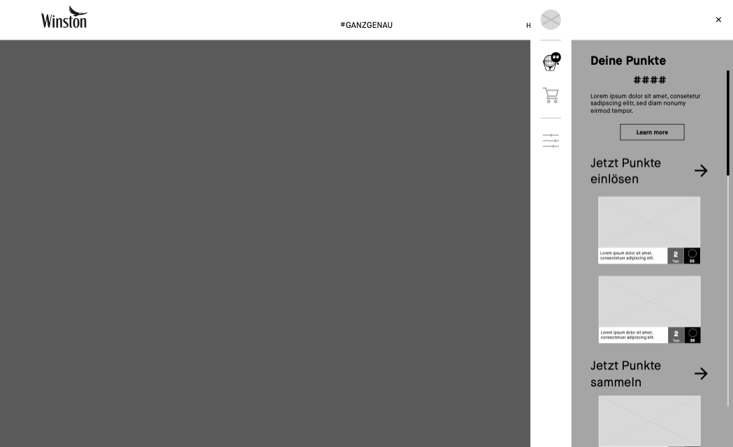
When the user comes on the page for the first time, an overlay opens. The overlay welcomes the user and explains the token system. And forwards the user either to earn tokens or to learn more about the token system.
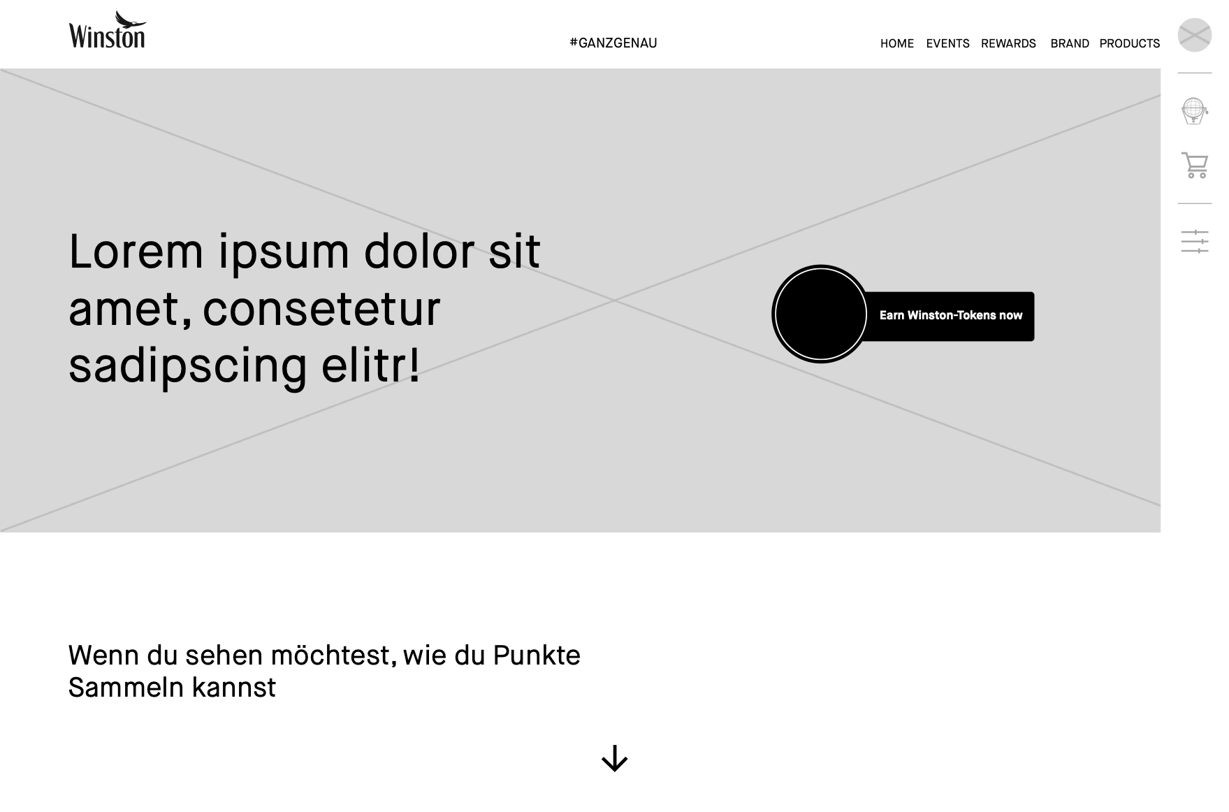
When the user clicks on the button to learn more they get to a page, where the token system gets explanied to the user in more detail and activates the user to participate in order to earn tokens.
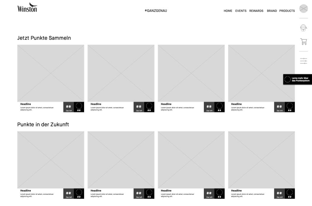
At the end the get forwarded to an overview of all activations regarding the token system, from raffles to infos, that will generate tokens for the user.
When the user clicks on one of the teasers, the overlay of the referring possibility to earn tokens appears.
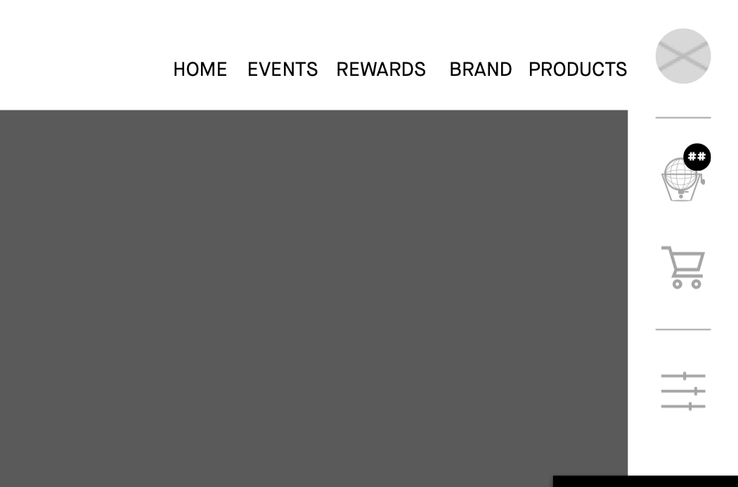
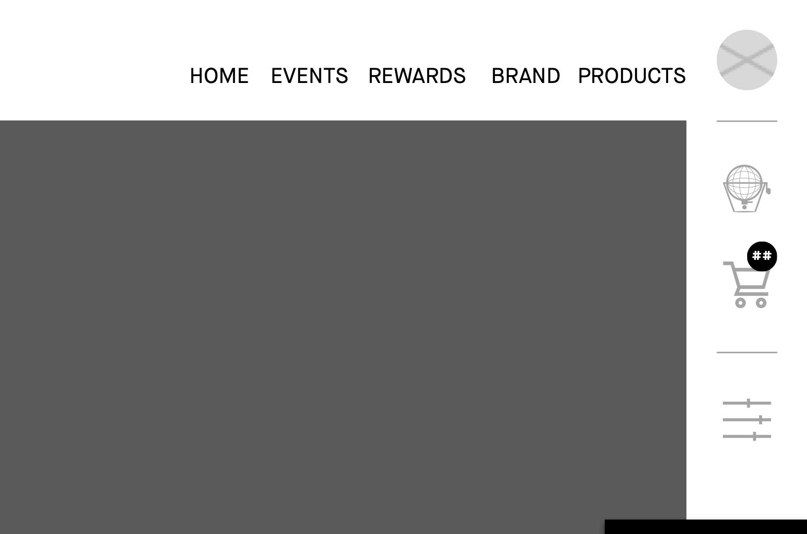
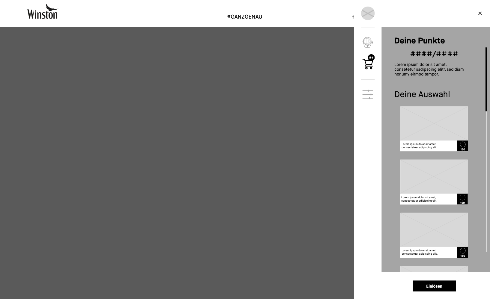
The counter on the top of raffle icon in the sidebar shows the user how many tokens they currently own.
When the click on the raffle icon the token sidebar opens and shows the user teaser to spent or earn more tokens.
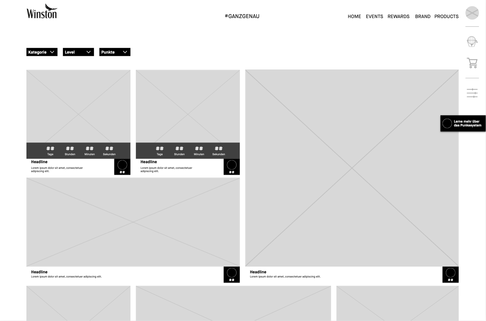
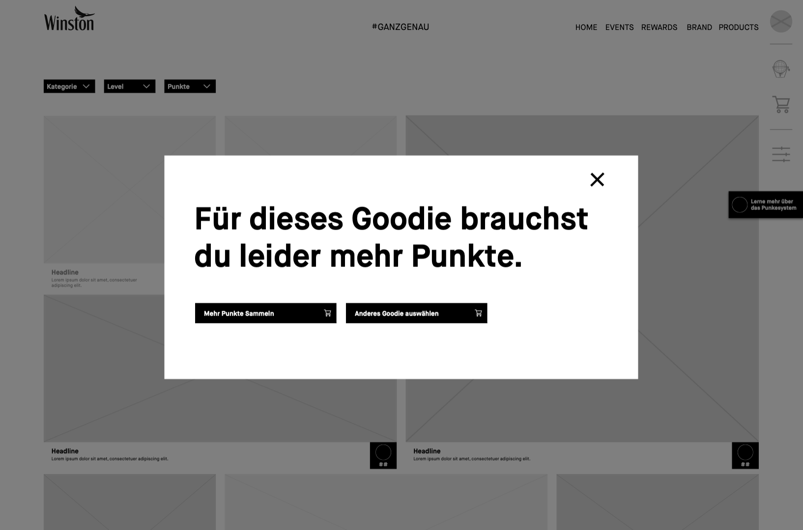
The goodies page gives the user an overview of all goodies we have to offer. Depending on the price the teaser sizes vary.
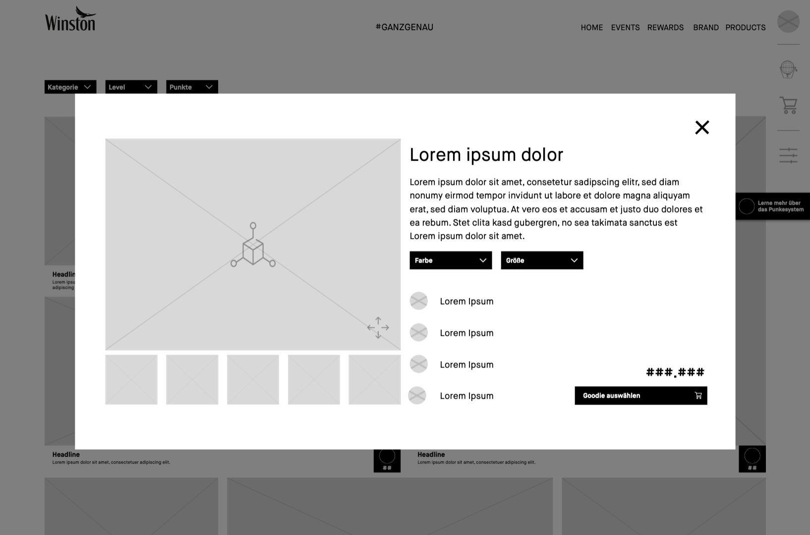
When the user clicks on one of the teaser an overlay opens, giving the user detail information about the goodie and lets the user add the goodie to the basket.
Should the user haven’t gotten enough token, we tell them and give them the opertunity to either choose another goodie or earn more tokens.
The counter on the basket icon shows the user how many goodies they have selected and activates to order them.
When the click on the basket icon the basket sidebar opens and shows the user teaser of goodies they have added to the basket.
The check out page lets the user check everything bevor the final order.
Thanks the user for the order and activates to continue to participate.
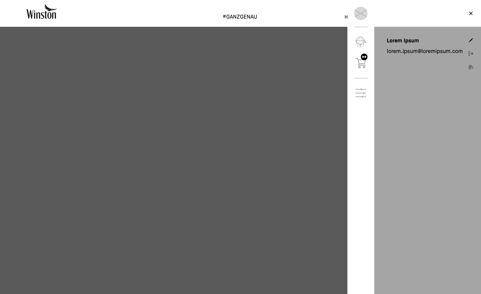
The user also can click on their profil to open it.
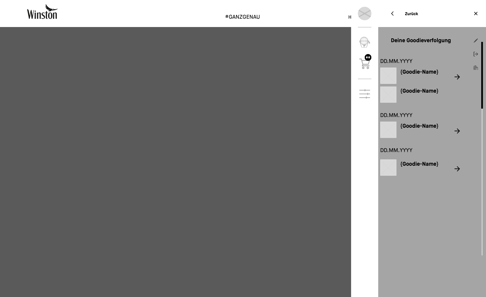
There they find an icon thats opens the track and trace sidebar.
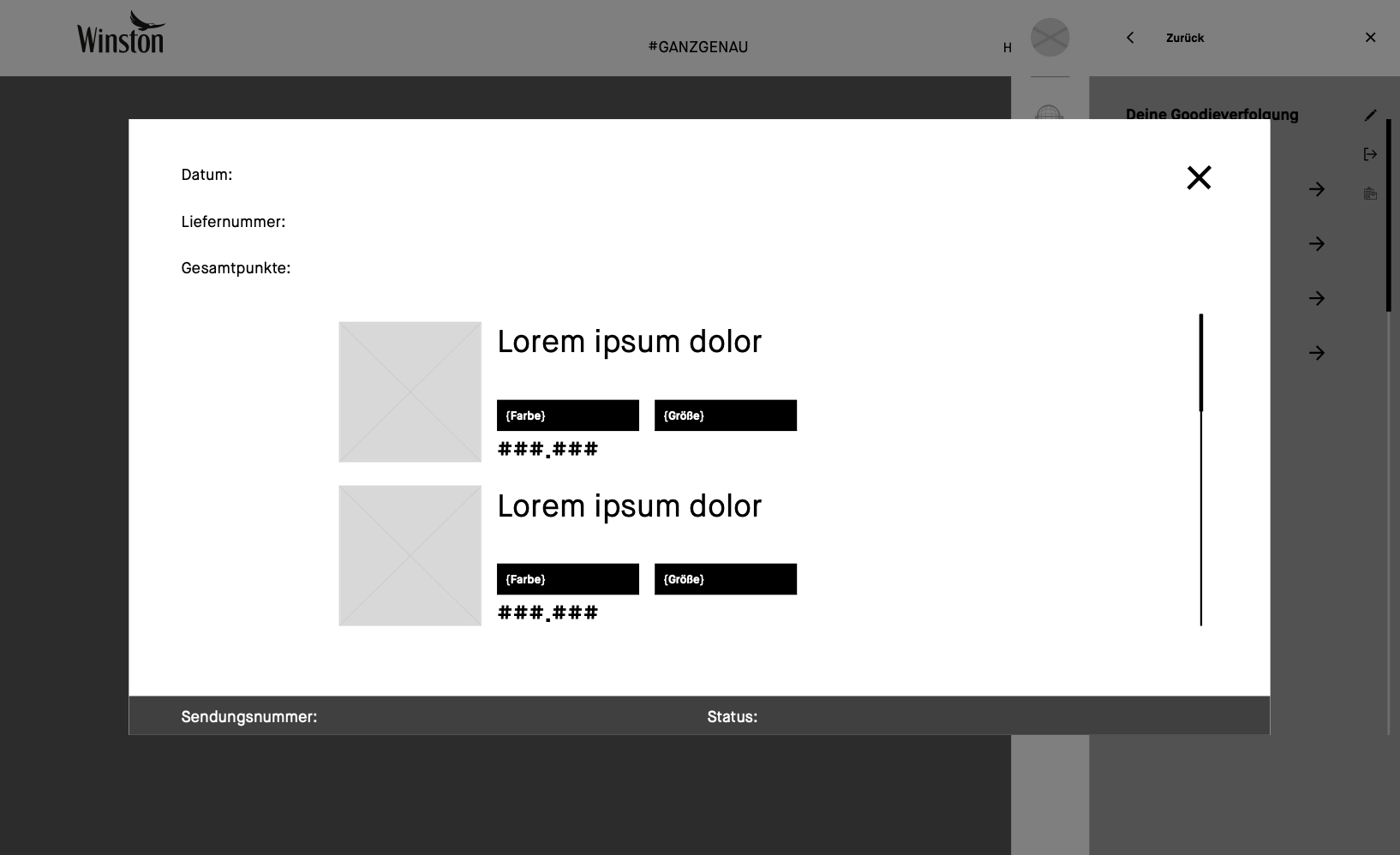
There they see their orders and can click on the arrow to open the track and trace.
The track and trace overlay shows the user the where the package is at the moment. It is conennected with the parcel service.
Like what you see? Let’s talk about how to make your digital experience better, faster, easier and more fun to use!
There where two brands, two communities. Our mission was to create one community, by relaunch a new Winston website. With a goal of 200k members by July. The task was to make sure, that we migrate and kepp the existing members, in addition to winning new ones. My special task was to simplify & automate the user sign up processes as much as possible. One obsticle was, that we are not allowed to speack about what the community was before we know, tha user is over 18 years old and has signed up successfully.
Idea
Our idea was to split the registration process into 3 parts: registration, authentication and the log in.
Concept
Authentification
First of all we looked at different AVS. The age verification system (AVS) provider than validates the contact information and gives feedback if the user is over 18. There are a couple of ways to validate. As the most secure, we made the selection of 3. Together with the client we decided on ‚Database via Schufa‘ as it was fastes und less complicated for the user.
Entry Process
Brainstorm
We used a white board to scribble down the entry process. This way we could define every single step we had and rearange them pretty easily before we start wireframing them. And make sure we don’t forgett a step.
We also desided with the client, that we will follow the step-by-step approach. That way we don’t show the user to much input fields at once and reduce the risk of user abondening the registration process. Also the step-by-step approach gives us more possigbilites of a clearer communication, since we have more space for every step.
On the whiteboard we started to mark where we need what kind of error massage.
Entry
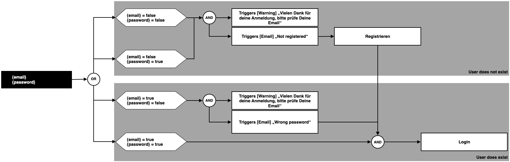
Since we reallized that in both processes, ‚Registration‘ & ‚Login‘ we need the ‚E-Mail-Adress‘ and the ‚Password‘ we placed them also at the beginning of the registration process. That enabled us to program the whole entry process as one. So that it doesn’t matter if you are sign up or log in.
We wrote down every ‚E-Mail‘ and ‚Password‘ scenario and definde what the outcome should be. Should it be the ‚Registration‘ process or are simply loggin them in.
Login
We wrote the user flow as an EPC process, so could define what states the single elements are.
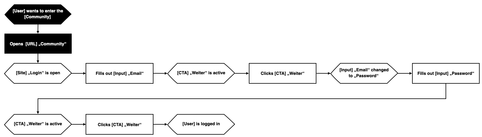
The tabs ‚Anmelden‘ and ‚Registrieren‘ only had the porpuse of giving the user orientation if needed, but they didn’t change the form anymore.
We also wireframed the mobile version.
Registration
In the registration process we also defined that the list on the right gets checked. That gives the user a feeling of accomplishment, which reduces the risk of abondoning the process.
We enabled the user to jump from one step back to another finished step. Also, the address field was connected with the ‚Google API‘, so we offer the user a type ahead and autofill for their address. The user could controll everything via keyboard or mouse.
We also wireframed the mobile version.
Testing
We tracked every step and every every interaction via pageviews and event tracking within Google Analytics.
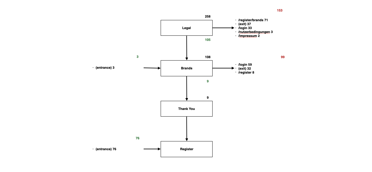
In the beginning of the registration funnel we see some wobbling around between the log in tab and the registration tab, but that is kind of normal in this step. But we are loosing people after they went to the secondary pages like Impressum. We should look, if we can make easier for them to come back into the process.
We were also loosing registration at the steps “birthday”, “address“ and “phone number”. Specially with the step address we can make even easier for the user.
Most users have lost, was at the legal step. Since the only mandatory part here is the Schufa, we need a better explanation and a possible alternativ. The Brand part will be kicked. Thus, it doesn’t need any attention.
Half of the people login in our site are exiting immediately. Possible reasons are the lack of understanding and not knowing what to do on the website. Content needs to be more immersive and the login process with more user centered functionalities.
From the analysis of the goal funnel for the entry process we have learned that need to guide the user in a clearer way through everything. So decided to conentrate on explanatory copy and error massages.
Like what you see? Let’s talk about how to make your digital experience better, faster, easier and more fun to use!
The client wanted a new website for their premium adventure escapes. Not an ordinary travel experience. A trip you can only get with Red Bull and their brand ambassadors. Red Bull is already the leading lifestyle brand when it comes to adventure sports, culture, art & music in all its shapes and forms. The task now is to transfer the same level of brand confidence to Destination Red Bull and the travel category. The user has to get a clear idea of what the trip feels like, while the experience has to reflect the Red Bull brand.
Analytics
When we looked at the numbers of the old website, we saw, that we had a lot of traffic coming in, but one 5% did interact with the site and only 1,37% of those did become leads. While most traffic was coming from social, traffic from organic search had a way higher possibility to become a lead.
Idea
So we came up with the idea of using elements and modules known from the Red Bull website to transfer to generate a holistic brand experience. But to break that open with new modules that are more focused on story telling, than classical travel websites.
Homepage Destination Red Bull
Concept
Target Group
As our target group we defined a global market with the core markets: Austria, Germany, Switzerland, France, UK and USA. Travelers with a craving for recognition and individualized, unique experiences. Sporty, adventurous or cultural people. We changed the target gender from 75% male to 50 % female. Also we shifted the age range from 25 to 54 years, to 19 to 35 years.
User Flows
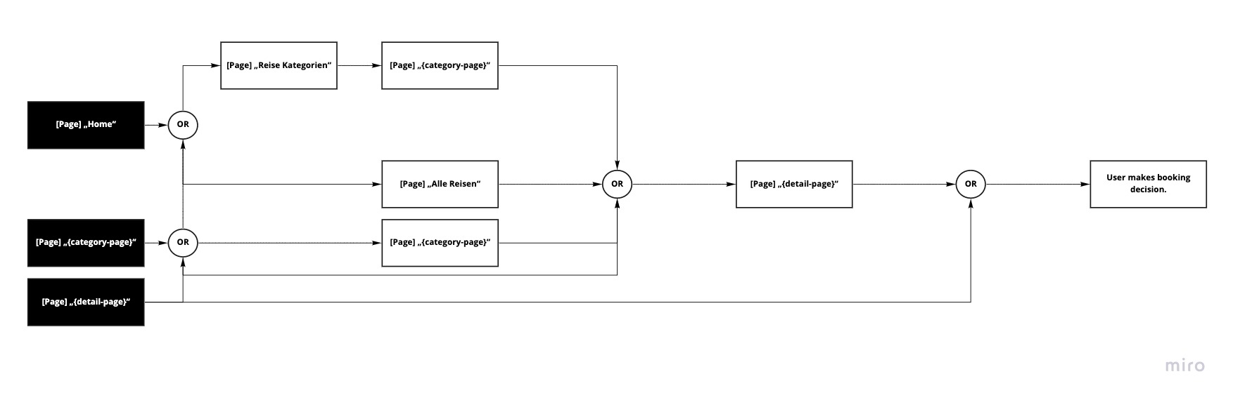
Before we did build the framework of the new site, we had to take a deeper look at possible user flows on our site. Starting with the traffic sources. From our analytics data we learned that most people are coming from social, direct and referral and only a quarter from organic search. How do we generate more traffic from organic search and bring them to convert. The answer i quality content, people are searching for. It has to be unique and relevant. For that we are not only optimizing the sites as they are, but also introducing category pages. Giving the opportunity for more relevant content and enabling users to find the destination website, even if there are no trips for that category.
This will result in two main landing pages or entry points, the homepage and the category pages. From there we guide the user in an easy to understand way to their trip. We have three main ways, they either go to the category page, decide for a category and then for a concrete trip. Or they go the site with an overview of all trips and then to the concrete trip. Or they go directly to a concrete trip.
Structure
The [Site] „All trips“ stayed as an overview page. We created two templates for the detail pages. One for brand ambassadors centric trips and one when the focus is on the package itself. A page for an overview over all categories will also be implemented as a detail site for every category. This raises the visibility for search engines. We put the general FAQs & Contact into the secondary navigation within the footer.
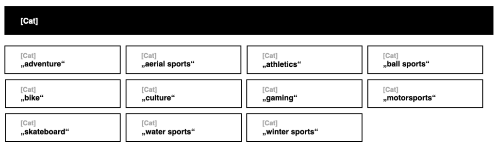
Also we concepted a tag system consisting of the tag types: [Cat] and [Trip]
[Cat] stands for categories like: adventure, arial sports, ball sports, bike, culture, …
[Trip] is a tag for every trip, which we had 10 at the beginning of the project.
Interactive Modules
Before we started to design every page we needed, we concentrated on the interactive modules. Those were a map with the trips on it, a automated slider module with all the trips, and a contact form.
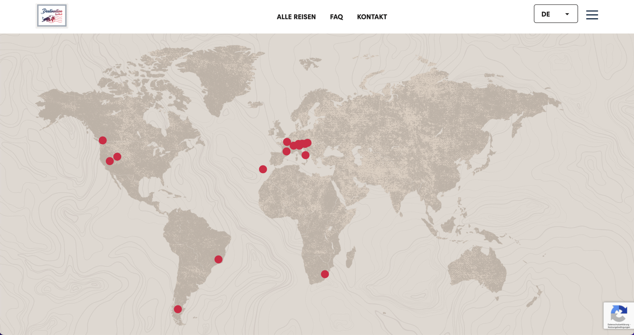
Interactive Map
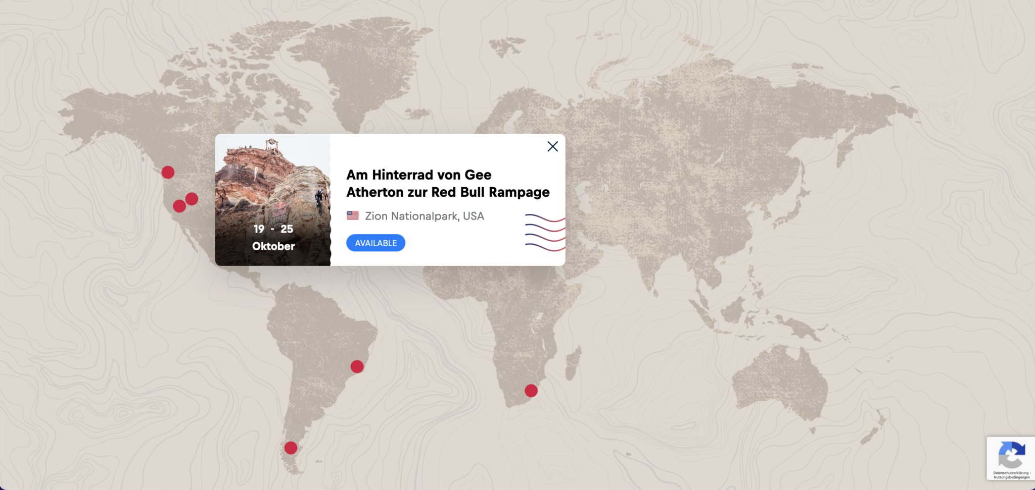
There will me a module with a map. Every trip will get a marker on that map. The default view is the whole world. The user can zoom in and out with clicking on the plus or minus icon. When zoomed in, the map can be navigated by click and hold.
When user hovers over one of the markers, we show them a teaser for the trip. When clicked the user gets forwarded to the detail-page of that package.
Automated Slider
We created at automated slider. Every slide should contain of the teaser contend for a trip. The function, that made this slider special was that, the user had not only an indicator, for how long the slide is on, before changing to the next, but also a written preview which trip will be next. Also the user can click on one of the previews to jump to the next slide.
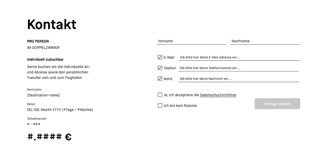
Request From
After the click the content changes. The user sees two columns. The left column shows the most prime facts about the trip and the price. The right column builds the contact form. Which gets a premium look by simplicity.
The user only has to put in their name and either an e-mail-address or a phone number. When the user clicked the checkbox the input field will appear.
The last step is to check the privacy policy and the captcha to activated the CTA.
When the contact informations are successfully send, the users sees a thank you message and gets an e-mail with all the informations needed.
Main Pages
We defined the homepage, the page ‚All Trips‘ and the detail page for every trip as the main pages on this website.
The old career website needed a rebrush, it needs better adapt the toom design language. It also should become more intuativ and inactive.
Idea
Since toom is a company that has jobs around whole germany, the idea was to create jobsearch that is connected and centered aroung a interactive map.
Concept
But because it was a website with pure content pages but also a complex jobsearch, we decided to split the app in different working packages. To do so, we made a workshop with the client, where we reorganized the content and definied structure of the new website. The result of that workshop was the new sitemap.
With that new sitemap we could split the app in the following working packages:
Navigation
Homepage
Benefits
Departments
Search
We decided to start with the purly content based areas and pages. So they can be developt while the rest of us concentrates on the search.
Navigation
As the header we decided on the same design and functionality as the toom website, so the user has a holistic navigation through the whole toom websiteverse.
Homepage
Since the whole website and search should be revovling around the interactive map, of course we placed it prominent on the homepage. Without overpowering the other teaser to other areas of the website, for users that need more information before going to the search.
Benefits
On the benefit page, as on the other pages we tried to be as clean as possible and concentrate on what is important for the potential applicant. So, after a little poll with toom employees we decided on eight benefits that get highlighted. The rest we catagorized and only showed the title of the benefit. For more information the user could open the dropdown. That way we gave the user an quick overview over all benefits.
Departments
Departments Overviewpage
Because toom has a lot of departments and we have potential applicants that only want to see jobs at the headquater or at the markets, we implemented a filter.
Department Detailpage
For every department we created one page with a describing copy, a short video to give a better inside into the worksituation.
If the department had subsection we showed information for those, too. Under the discribtion in dropdowns.
Jobpage
The jobpage has 2 stages, with and without vacancies. With simply the location, data and a button to apply appears.
It always has a written discription and a video about the job. Also what compentances the apllicant needs to have.
Search
User Flow
We created a simple user flow on how to get to the jobsearch.
Wireframes
To make it the user as easy as possible we showed them a map. On that map we clustered the job vacancies and showed them, where they are in Germany.
When the user hovered over a cluster, we showed them the job vacacies. The vacancies could be filtert, with the filters about. The user also could click on one of the clusteres and the map would zoom in and shows the next level of clusteres.
Also every change in filters or clicking on a cluster has immediate effect on the list under the map.
The client wanted a tool with which their sales team could approach potential clients. The tool should showcase the possible production lines of their new industrial direct-to-garment printer for mass production. And highlight the benefits in the financial input and potential output.
Idea
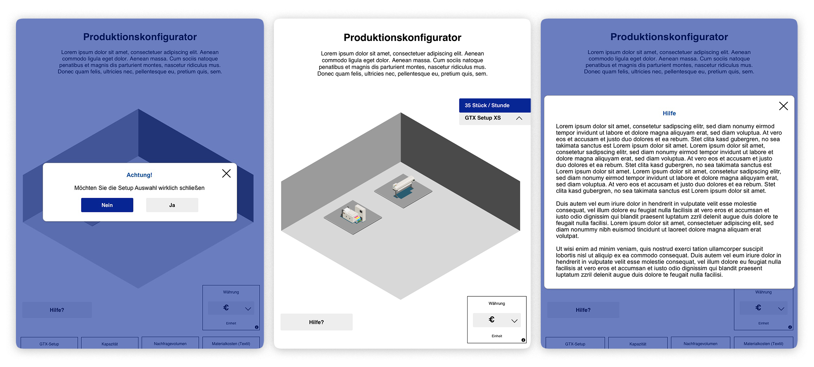
So we came up with the idea to create a website, that could easily used via tablet. The side would showcase different production scenarios in 3D. The scenarios would be based on the production outcome the client wanted. It would show what machinery would be needed. Additional to the 3D production planer, we would integrate a cross margin calculator.
3D production planer
Cross margin calculator
Concept
Production process
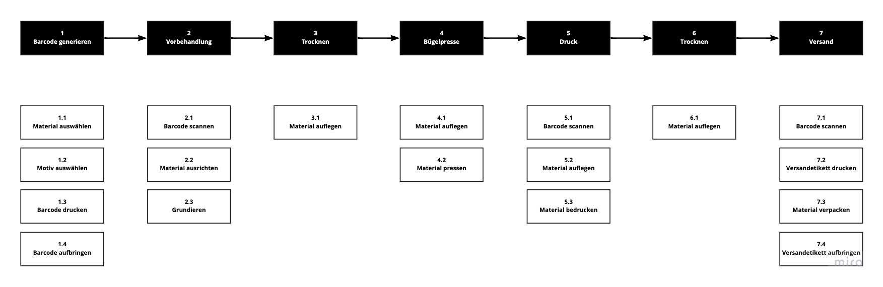
Since the client did not have a written down process by hand, I watched their tutorial video. While I did that, I wrote down every single step of the process, and also grouped the steps into a top level flow, for a easier understanding.
Production setup
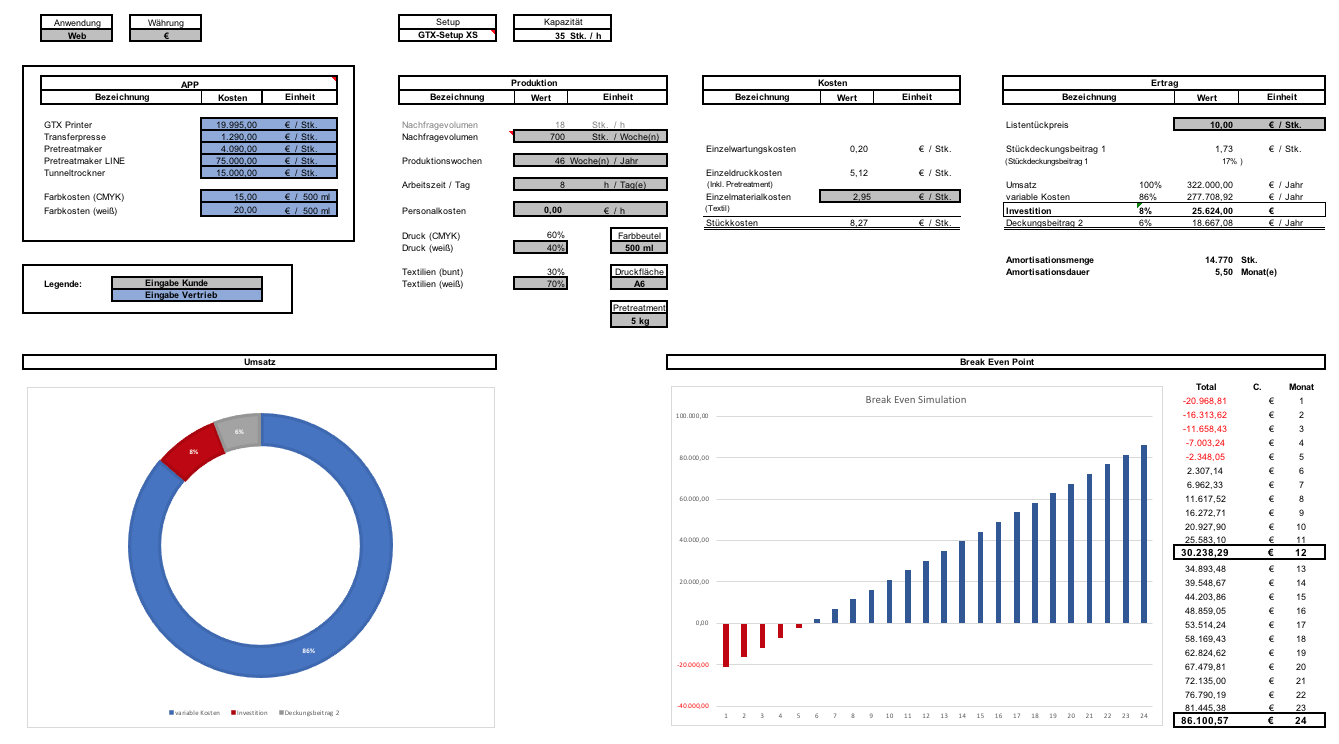
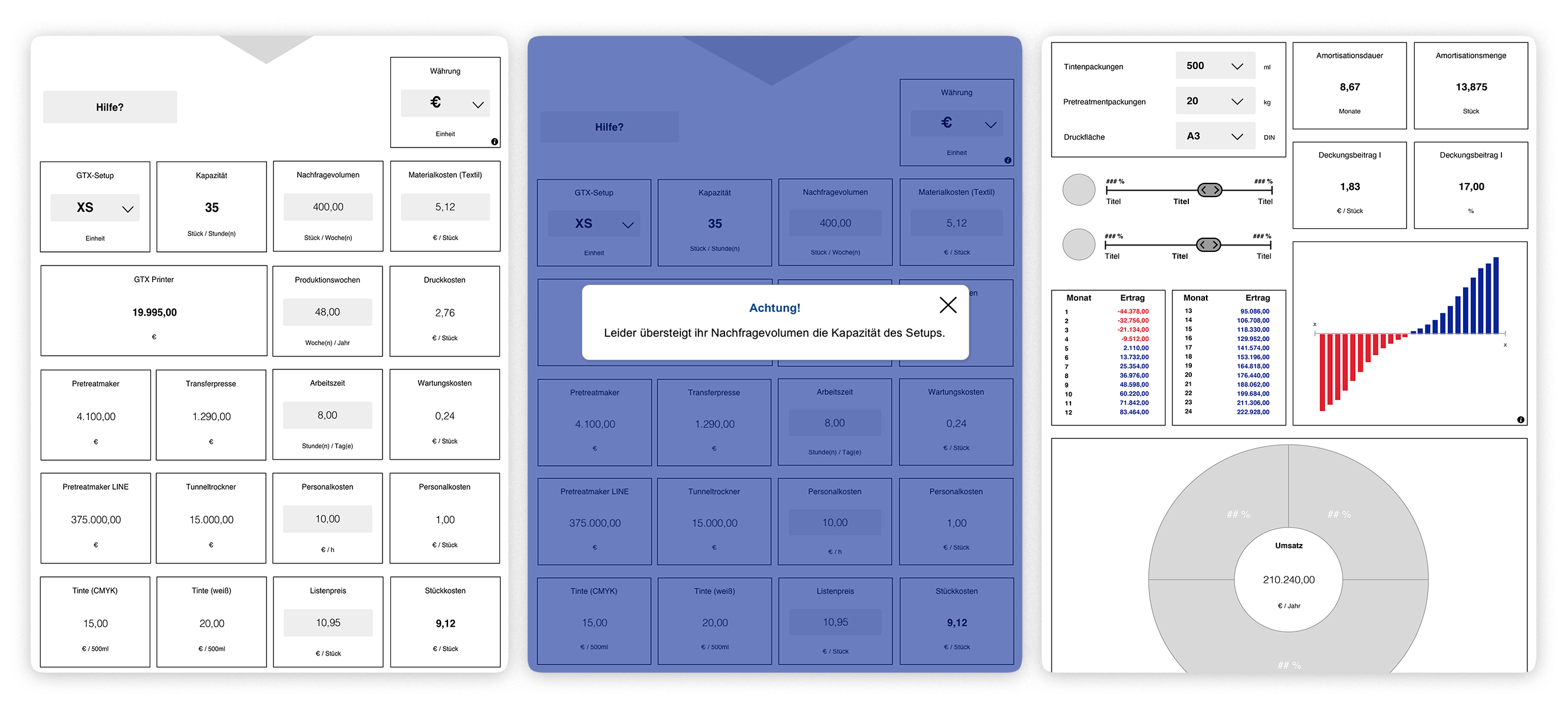
After I clarified the production process with the client, we created a table together. The table included the different setups and what kind of machinery, how many of those machines are necessary and how big the capacity per hour is.
Gross margin calculation
Based on the price lists and the estimated consumption I created a interactive prototype of the calculator in Microsoft Excel. With the calculator we could check with the client, if all calculation are going right, before we started programming them.
The calculator was build in a way, that the sales team could adjust the cost and put in the clients production information, to see how high the costs are, how high the output would be and whats the calculated gross margin is. Additional we showed after how many month the investment will be amortized.
Wireframing
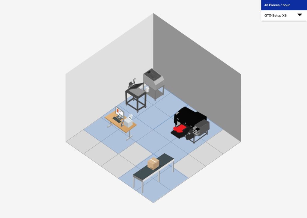
With the conceptual backbone done I could start wireframing. I designed a 3D interactive production line configurator. The user could change the set up via the drop down, while having a overview of machines needed and what the output will be.
We integrated helpful messages to guide the user, pro or beginner, through the process of finding the perfect setup for their production.
The 3D configurator is followed by the calculator. Both are directly connected to each other. If the user changes a attribute, that has implications to the other. It will change it there to. When conflicts appears the user is notified.
For users that are more comfortable with step-by-step we integrated the option on the button of the application. But this view is also seen, when the user activate an input field. So the user is enabled to switch between the two entry methods as they please.
Web App
Together with our developers we decided to program the website as an progressive web app. With that, we could easily prepare the tablets of their sales people as well as tablets at their both at the trade fair.
Like what you see? Let’s talk about how to make your digital experience better, faster, easier and more fun to use!
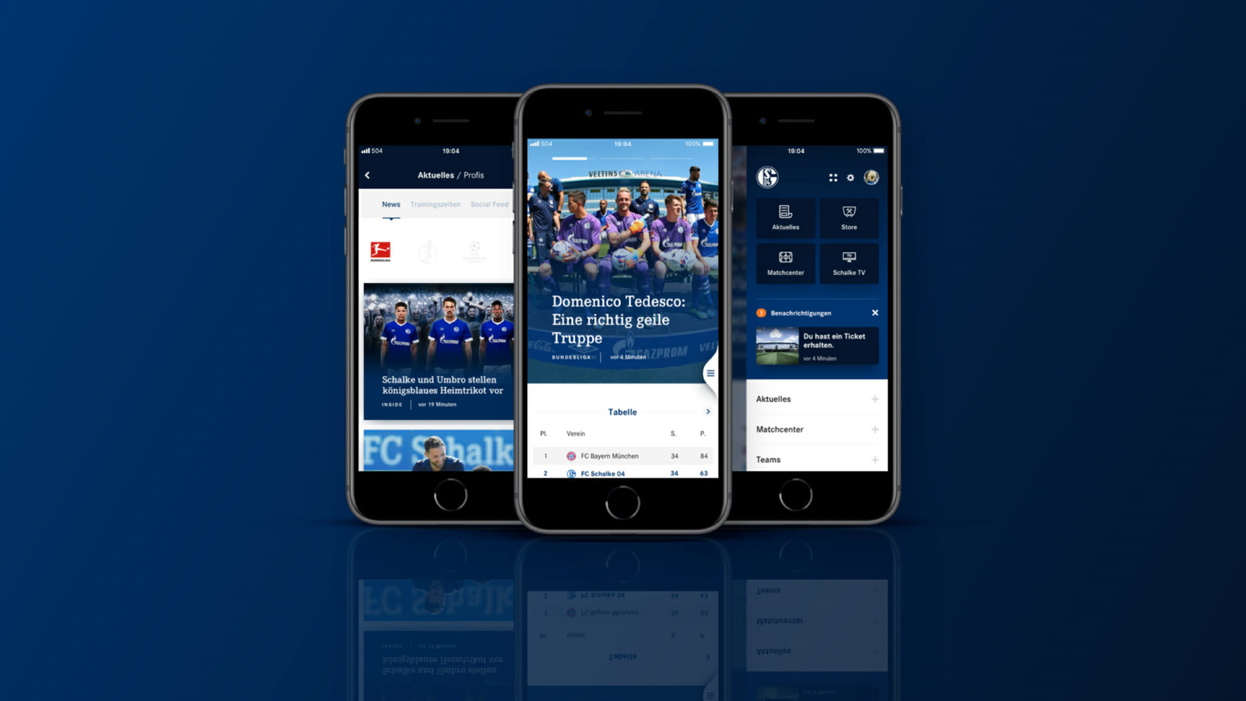
Above all, the most important requirement was that the performance, function & development of the app reflect the quality, passion and tradition of the club. What was desired was a unique and comprehensive brand and user experience in the entire Schalke world that lived up to the spirit of the times. In addition, the app should map all digital services of Schalke 04 in the form of individual containers and play or display the individual containers according to the situation or location.
Idea
The concept of the old App was reconsidered completly. The new one was newly developed. We completely rethought the current app, redesigned it and gave it a more modern design to avoid any more discrepancies to the website. We were going to concentrate on the matchcenter and players.
Concept
But because it was a really big and complex app, we decided to split the app in different working packages. To do so, we made a workshop with the client, where we reorganized the content and definied structure of the new app. The result of that workshop was the new sitemap.
With that new sitemap we could split the app in the following working packages:
Navigation
Homescreen
News
Matchcenter
Teams
Store
Schalke TV
VELTINS-Arena
Settings
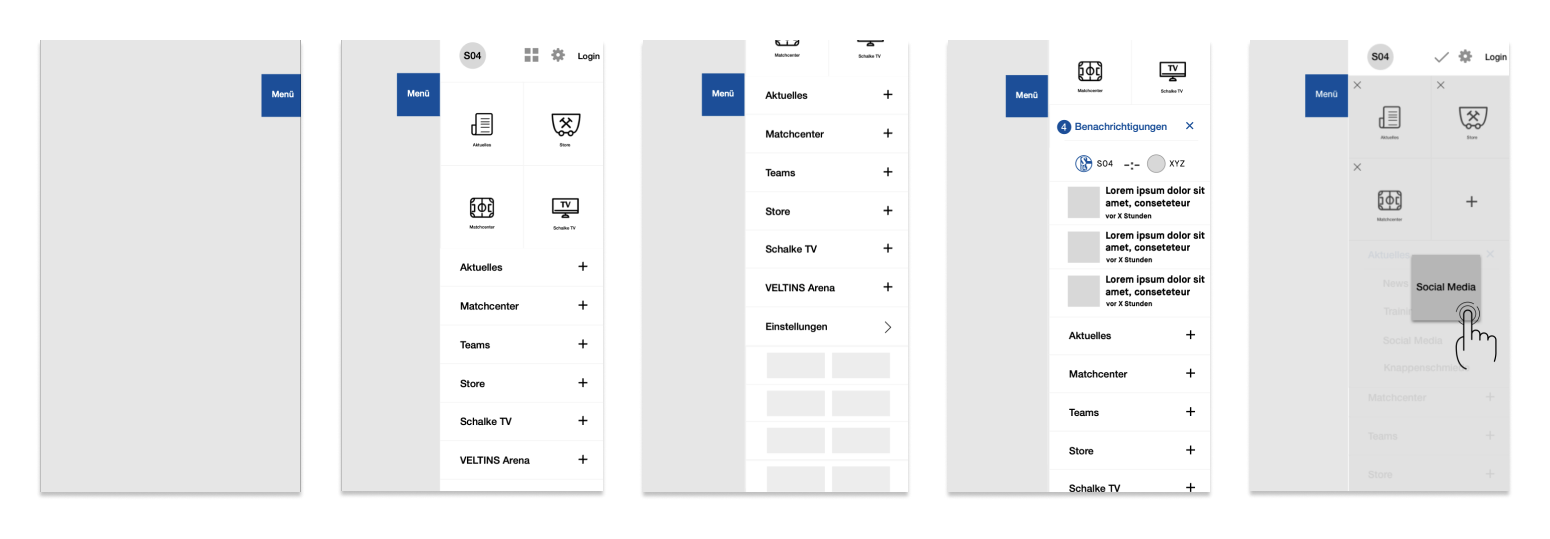
Navigation
We designed a menu, that could be open via tab on menu flag or with a swipe from the right margin of the screen inwards. Within the Menu important stuff like the login, settings. Under them we placed quicklinks, which could be reorganized by the user. We also placed a container for nofications and the score of an ongoing game. Under the dropdown menu for the main areas of the app, we also found place to put the sponsors.
Homescreen
Depending on the time and location relating to a match the content on the homescreen adapts. It shows the user different content during the match and depends on whether you are watching the game in the stadium or at home.This way we can get the most important content to the user, that he might be interested in at that particular time and space, without having to look for it in the app.
News
Together with the client and data from previous tracking, we defined the structure of the news area.
Site Header
The Arrow on the left side, the user gets back.
Site Header Dropdown
Here the user can choose between the two main news categories.
Slidermenu
With the slider, the user can navigate between the three subcatagories.
Site Header + Slidermenu
Only the slidermenu is sticky. But as soon as the user scrolls upwards, the site header apears again.
We gave the user the possibility to filter the content via tags. For example the tournaments or social channels.
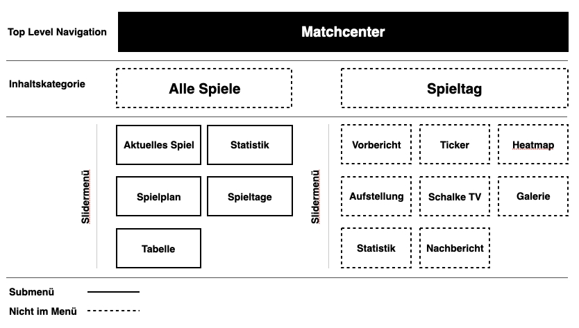
Matchcenter
Also for matchcenter we looked at previous data from the website to find the most important content for the user about a game and defined the structure again with the client based on that data.
Site Header
The Arrow on the left side, the user gets back.
Slidermenu
With the slider, the user can navigate between the three subcatagories.
Site Header + Slidermenu
Only the slidermenu is sticky. But as soon as the user scrolls upwards, the site header apears again.
Matchday Header
Includs the teams, score and date. With a click on the date a dropdown opens and the user can change the game.
Slidermenu
With the slider, the user can navigate between the three subcatagories.
Split between matchcenter and matchday we showed the user the most importend and used content like statistics and lineup. With a swip over the screen, the user changes the subcategory.
Teams
Simliar to the structure of the news feed, we created the navigation for the Teams. So we could fit the professionals team and the youth teams in one area without overcrowding it.
Also it aloud us to use almost the same navigation, we used for the news area and the matchcenter. So the user could use the already learned navigation to easily consume a massiv amount of information without losing the oversight.
We placed the diffrent possitions in dropdown menus to make the overview page easier to consum. For the player, we placed the highlight numbers on the first viewport to give it a little bit of gamification character. Than we seperated the content in different categories, which the user can easily swipe through.
Store
So that we can concentrate on the development of the news, matchcenter and team areas, we decided to implement the store section as an iFrame and to make a different project after the relaunch.
Schalke TV
We implemented the streaming service ‚Schalke TV‘ nativly. So the user can have the fastes possible experience. They also can login into their account, or create one, if they don’t have one.
VELTINS Arena
Pay on Schalke
Since the ‚Knappenkarte‘ and the ‚Schalke Trikot‘ already brought the technology to pay without cash but with NFC, we im plented that technology also into the app.
Tickets
Since tickets work via barcode, we could also implement that technology into the app. And even give the user the possibilty to add the ticket to the wallet or send it to another user.
Settings
Everything like language or your logins etc could be changed within the settings.
Result
The new app is pushing the club FC Schalke 04 forward to be the Bundeliga’s digital leader and completes the digital ecosystem as well as mobile experience for every fan of the club so far.
App Store
Play Store
Like what you see? Let’s talk about how to make your digital experience better, faster, easier and more fun to use!