Above all, the most important requirement was that the performance, function & development of the app reflect the quality, passion and tradition of the club. What was desired was a unique and comprehensive brand and user experience in the entire Schalke world that lived up to the spirit of the times. In addition, the app should map all digital services of Schalke 04 in the form of individual containers and play or display the individual containers according to the situation or location.
Idea
The concept of the old App was reconsidered completly. The new one was newly developed. We completely rethought the current app, redesigned it and gave it a more modern design to avoid any more discrepancies to the website. We were going to concentrate on the matchcenter and players.
Concept
But because it was a really big and complex app, we decided to split the app in different working packages. To do so, we made a workshop with the client, where we reorganized the content and definied structure of the new app. The result of that workshop was the new sitemap.
With that new sitemap we could split the app in the following working packages:
Navigation
Homescreen
News
Matchcenter
Teams
Store
Schalke TV
VELTINS-Arena
Settings
Navigation
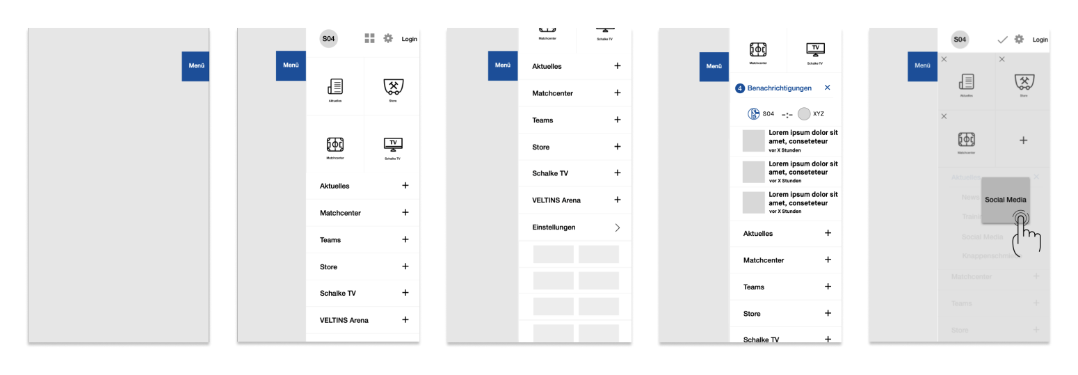
We designed a menu, that could be open via tab on menu flag or with a swipe from the right margin of the screen inwards. Within the Menu important stuff like the login, settings. Under them we placed quicklinks, which could be reorganized by the user. We also placed a container for nofications and the score of an ongoing game. Under the dropdown menu for the main areas of the app, we also found place to put the sponsors.
Homescreen
Depending on the time and location relating to a match the content on the homescreen adapts. It shows the user different content during the match and depends on whether you are watching the game in the stadium or at home.This way we can get the most important content to the user, that he might be interested in at that particular time and space, without having to look for it in the app.
News
Together with the client and data from previous tracking, we defined the structure of the news area.
Site Header
The Arrow on the left side, the user gets back.
Site Header Dropdown
Here the user can choose between the two main news categories.
Slidermenu
With the slider, the user can navigate between the three subcatagories.
Site Header + Slidermenu
Only the slidermenu is sticky. But as soon as the user scrolls upwards, the site header apears again.
We gave the user the possibility to filter the content via tags. For example the tournaments or social channels.
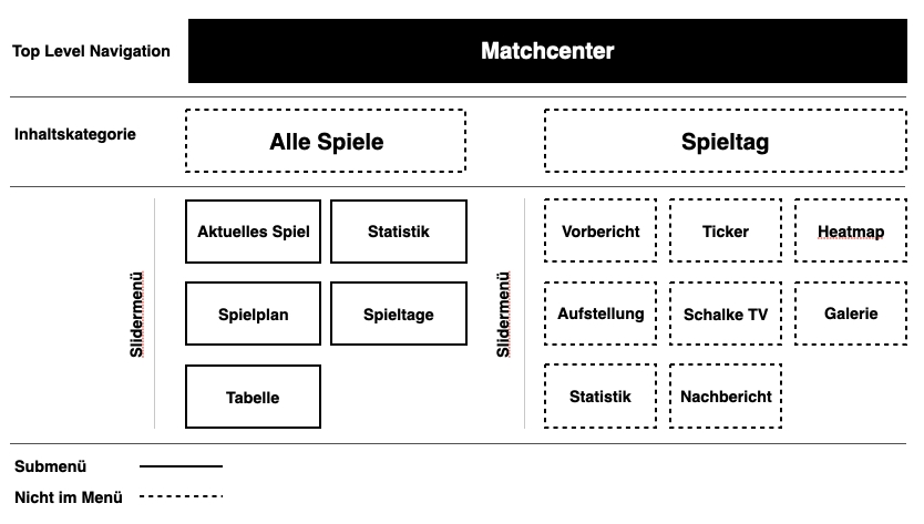
Matchcenter
Also for matchcenter we looked at previous data from the website to find the most important content for the user about a game and defined the structure again with the client based on that data.
Site Header
The Arrow on the left side, the user gets back.
Slidermenu
With the slider, the user can navigate between the three subcatagories.
Site Header + Slidermenu
Only the slidermenu is sticky. But as soon as the user scrolls upwards, the site header apears again.
Matchday Header
Includs the teams, score and date. With a click on the date a dropdown opens and the user can change the game.
Slidermenu
With the slider, the user can navigate between the three subcatagories.
Split between matchcenter and matchday we showed the user the most importend and used content like statistics and lineup. With a swip over the screen, the user changes the subcategory.
Teams
Simliar to the structure of the news feed, we created the navigation for the Teams. So we could fit the professionals team and the youth teams in one area without overcrowding it.
Also it aloud us to use almost the same navigation, we used for the news area and the matchcenter. So the user could use the already learned navigation to easily consume a massiv amount of information without losing the oversight.
We placed the diffrent possitions in dropdown menus to make the overview page easier to consum. For the player, we placed the highlight numbers on the first viewport to give it a little bit of gamification character. Than we seperated the content in different categories, which the user can easily swipe through.
Store
So that we can concentrate on the development of the news, matchcenter and team areas, we decided to implement the store section as an iFrame and to make a different project after the relaunch.
Schalke TV
We implemented the streaming service ‚Schalke TV‘ nativly. So the user can have the fastes possible experience. They also can login into their account, or create one, if they don’t have one.
VELTINS Arena
Pay on Schalke
Since the ‚Knappenkarte‘ and the ‚Schalke Trikot‘ already brought the technology to pay without cash but with NFC, we im plented that technology also into the app.
Tickets
Since tickets work via barcode, we could also implement that technology into the app. And even give the user the possibilty to add the ticket to the wallet or send it to another user.
Settings
Everything like language or your logins etc could be changed within the settings.
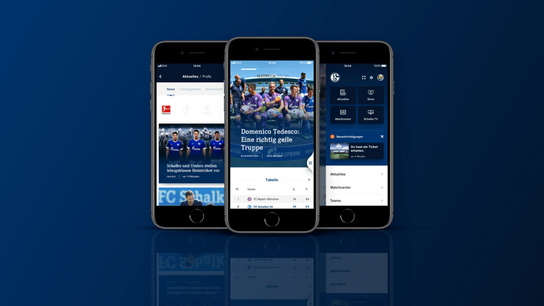
Result
The new app is pushing the club FC Schalke 04 forward to be the Bundeliga’s digital leader and completes the digital ecosystem as well as mobile experience for every fan of the club so far.
App Store
Play Store
Like what you see? Let’s talk about how to make your digital experience better, faster, easier and more fun to use!