There where two brands, two communities. Our mission was to create one community, by relaunch a new Winston website. With a goal of 200k members by July. The task was to make sure, that we migrate and kepp the existing members, in addition to winning new ones. My special task was to simplify & automate the user sign up processes as much as possible. One obsticle was, that we are not allowed to speack about what the community was before we know, tha user is over 18 years old and has signed up successfully.
Idea
Our idea was to split the registration process into 3 parts: registration, authentication and the log in.
Concept
Authentification
First of all we looked at different AVS. The age verification system (AVS) provider than validates the contact information and gives feedback if the user is over 18. There are a couple of ways to validate. As the most secure, we made the selection of 3. Together with the client we decided on ‚Database via Schufa‘ as it was fastes und less complicated for the user.
Entry Process
Brainstorm
We used a white board to scribble down the entry process. This way we could define every single step we had and rearange them pretty easily before we start wireframing them. And make sure we don’t forgett a step.
We also desided with the client, that we will follow the step-by-step approach. That way we don’t show the user to much input fields at once and reduce the risk of user abondening the registration process. Also the step-by-step approach gives us more possigbilites of a clearer communication, since we have more space for every step.
On the whiteboard we started to mark where we need what kind of error massage.
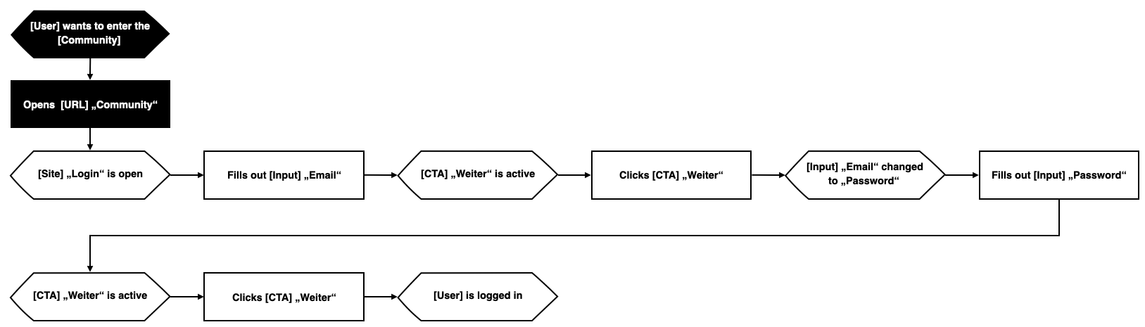
Entry
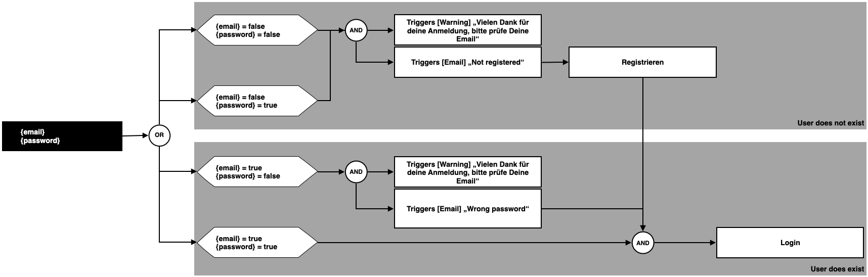
Since we reallized that in both processes, ‚Registration‘ & ‚Login‘ we need the ‚E-Mail-Adress‘ and the ‚Password‘ we placed them also at the beginning of the registration process. That enabled us to program the whole entry process as one. So that it doesn’t matter if you are sign up or log in.
We wrote down every ‚E-Mail‘ and ‚Password‘ scenario and definde what the outcome should be. Should it be the ‚Registration‘ process or are simply loggin them in.
Login
We wrote the user flow as an EPC process, so could define what states the single elements are.
The tabs ‚Anmelden‘ and ‚Registrieren‘ only had the porpuse of giving the user orientation if needed, but they didn’t change the form anymore.
We also wireframed the mobile version.
Registration
In the registration process we also defined that the list on the right gets checked. That gives the user a feeling of accomplishment, which reduces the risk of abondoning the process.
We enabled the user to jump from one step back to another finished step. Also, the address field was connected with the ‚Google API‘, so we offer the user a type ahead and autofill for their address. The user could controll everything via keyboard or mouse.
We also wireframed the mobile version.
Testing
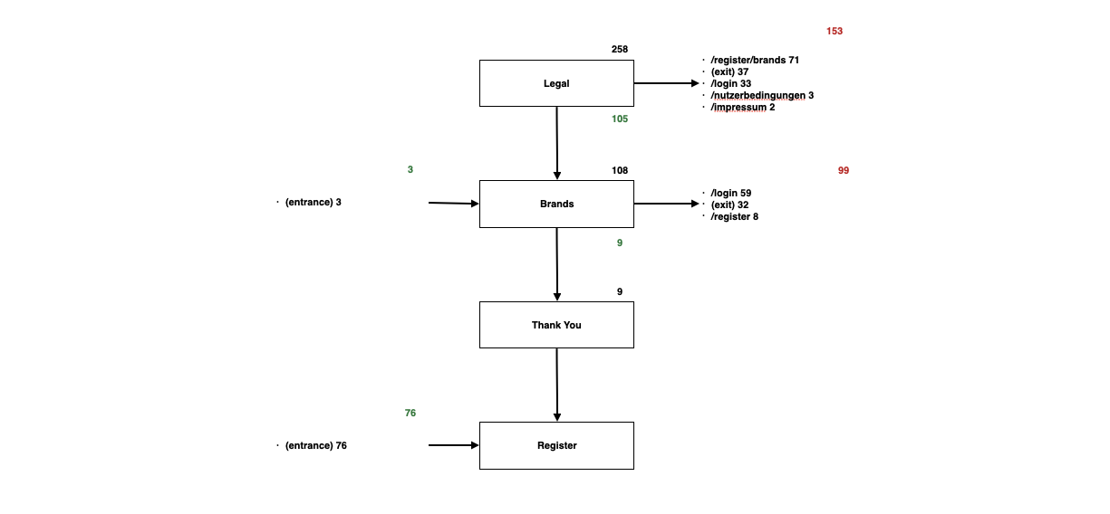
We tracked every step and every every interaction via pageviews and event tracking within Google Analytics.
In the beginning of the registration funnel we see some wobbling around between the log in tab and the registration tab, but that is kind of normal in this step. But we are loosing people after they went to the secondary pages like Impressum. We should look, if we can make easier for them to come back into the process.
We were also loosing registration at the steps “birthday”, “address“ and “phone number”. Specially with the step address we can make even easier for the user.
Most users have lost, was at the legal step. Since the only mandatory part here is the Schufa, we need a better explanation and a possible alternativ. The Brand part will be kicked. Thus, it doesn’t need any attention.
Half of the people login in our site are exiting immediately. Possible reasons are the lack of understanding and not knowing what to do on the website. Content needs to be more immersive and the login process with more user centered functionalities.
From the analysis of the goal funnel for the entry process we have learned that need to guide the user in a clearer way through everything. So decided to conentrate on explanatory copy and error massages.
Like what you see? Let’s talk about how to make your digital experience better, faster, easier and more fun to use!