Briefing
The client wanted a new website for their premium adventure escapes. Not an ordinary travel experience. A trip you can only get with Red Bull and their brand ambassadors. Red Bull is already the leading lifestyle brand when it comes to adventure sports, culture, art & music in all its shapes and forms. The task now is to transfer the same level of brand confidence to Destination Red Bull and the travel category. The user has to get a clear idea of what the trip feels like, while the experience has to reflect the Red Bull brand.
Analytics
When we looked at the numbers of the old website, we saw, that we had a lot of traffic coming in, but one 5% did interact with the site and only 1,37% of those did become leads. While most traffic was coming from social, traffic from organic search had a way higher possibility to become a lead.
Idea
So we came up with the idea of using elements and modules known from the Red Bull website to transfer to generate a holistic brand experience. But to break that open with new modules that are more focused on story telling, than classical travel websites.

Concept
Target Group
As our target group we defined a global market with the core markets: Austria, Germany, Switzerland, France, UK and USA. Travelers with a craving for recognition and individualized, unique experiences. Sporty, adventurous or cultural people. We changed the target gender from 75% male to 50 % female. Also we shifted the age range from 25 to 54 years, to 19 to 35 years.
User Flows
Before we did build the framework of the new site, we had to take a deeper look at possible user flows on our site. Starting with the traffic sources. From our analytics data we learned that most people are coming from social, direct and referral and only a quarter from organic search. How do we generate more traffic from organic search and bring them to convert. The answer i quality content, people are searching for. It has to be unique and relevant. For that we are not only optimizing the sites as they are, but also introducing category pages. Giving the opportunity for more relevant content and enabling users to find the destination website, even if there are no trips for that category.
This will result in two main landing pages or entry points, the homepage and the category pages. From there we guide the user in an easy to understand way to their trip. We have three main ways, they either go to the category page, decide for a category and then for a concrete trip. Or they go the site with an overview of all trips and then to the concrete trip. Or they go directly to a concrete trip.
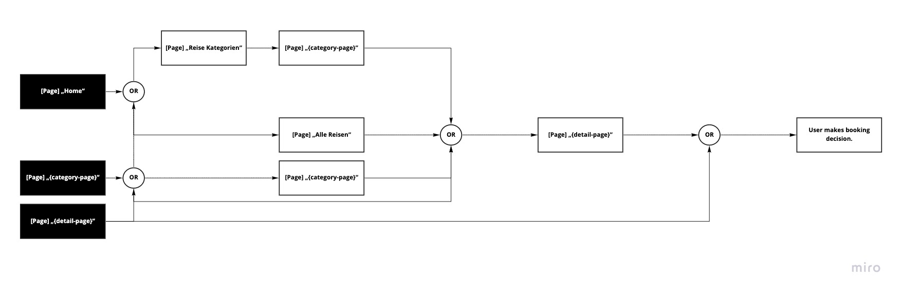
Structure
The [Site] „All trips“ stayed as an overview page. We created two templates for the detail pages. One for brand ambassadors centric trips and one when the focus is on the package itself.
A page for an overview over all categories will also be implemented as a detail site for every category. This raises the visibility for search engines.
We put the general FAQs & Contact into the secondary navigation within the footer.

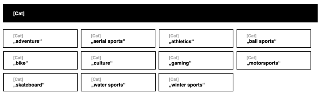
Also we concepted a tag system consisting of the tag types: [Cat] and [Trip]
[Cat] stands for categories like: adventure, arial sports, ball sports, bike, culture, …
[Trip] is a tag for every trip, which we had 10 at the beginning of the project.

Interactive Modules
Before we started to design every page we needed, we concentrated on the interactive modules. Those were a map with the trips on it, a automated slider module with all the trips, and a contact form.
Interactive Map
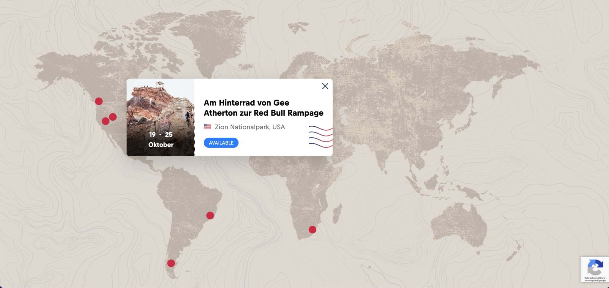
There will me a module with a map. Every trip will get a marker on that map. The default view is the whole world. The user can zoom in and out with clicking on the plus or minus icon. When zoomed in, the map can be navigated by click and hold.
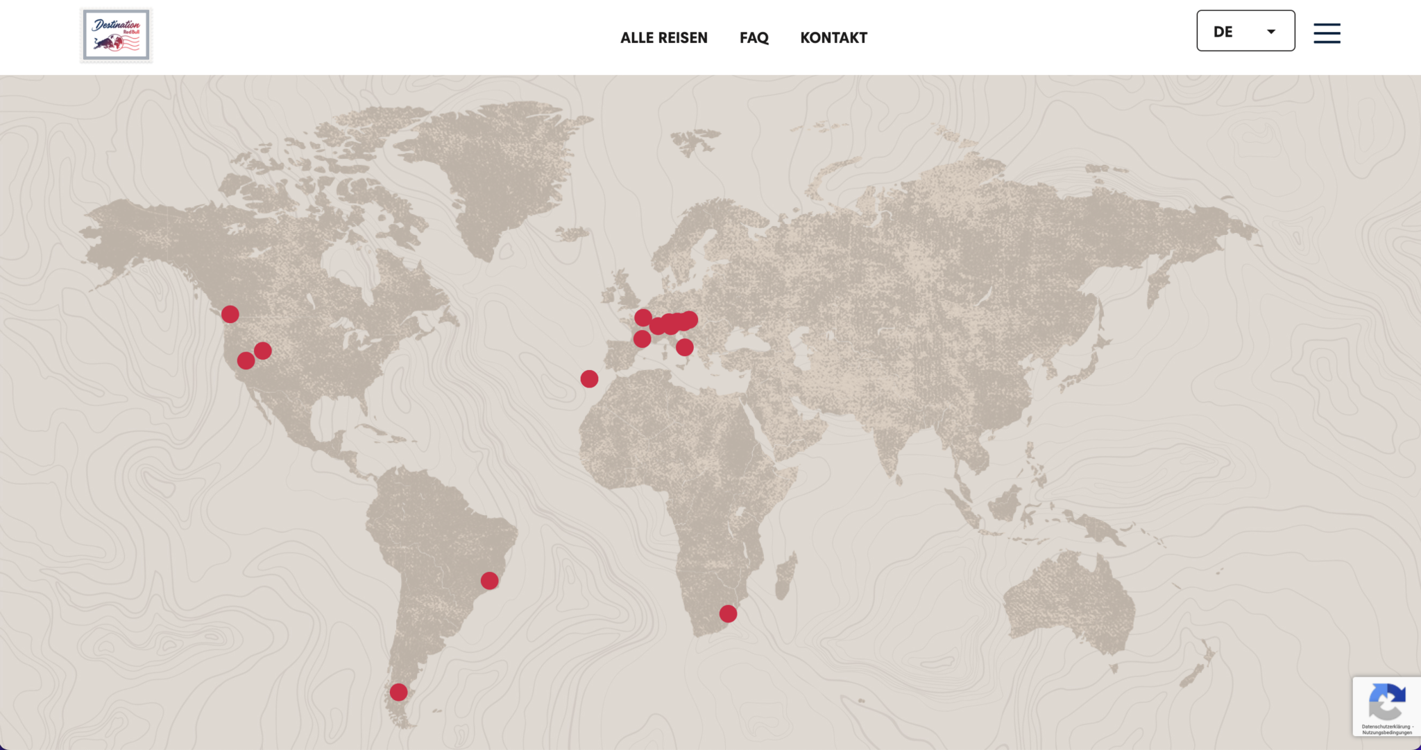
When user hovers over one of the markers, we show them a teaser for the trip. When clicked the user gets forwarded to the detail-page of that package.
Automated Slider
We created at automated slider. Every slide should contain of the teaser contend for a trip. The function, that made this slider special was that, the user had not only an indicator, for how long the slide is on, before changing to the next, but also a written preview which trip will be next. Also the user can click on one of the previews to jump to the next slide.
Request From
After the click the content changes. The user sees two columns. The left column shows the most prime facts about the trip and the price.
The right column builds the contact form. Which gets a premium look by simplicity.

The user only has to put in their name and either an e-mail-address or a phone number. When the user clicked the checkbox the input field will appear.
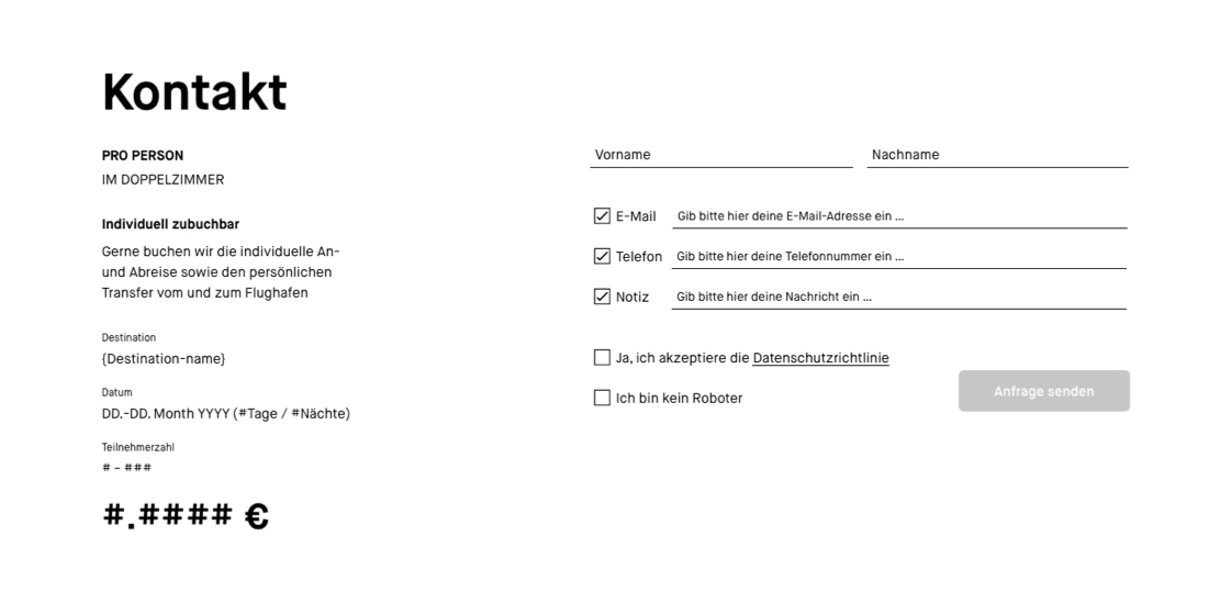
The last step is to check the privacy policy and the captcha to activated the CTA.

When the contact informations are successfully send, the users sees a thank you message and gets an e-mail with all the informations needed.

Main Pages
We defined the homepage, the page ‚All Trips‘ and the detail page for every trip as the main pages on this website.

Like what you see? Let’s talk about how to make your digital experience better, faster, easier and more fun to use!