The old career website needed a rebrush, it needs better adapt the toom design language. It also should become more intuativ and inactive.
Idea
Since toom is a company that has jobs around whole germany, the idea was to create jobsearch that is connected and centered aroung a interactive map.
Concept
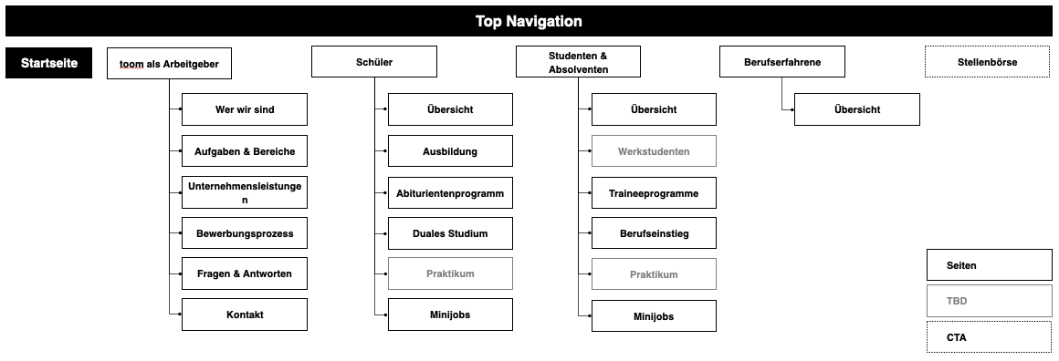
But because it was a website with pure content pages but also a complex jobsearch, we decided to split the app in different working packages. To do so, we made a workshop with the client, where we reorganized the content and definied structure of the new website. The result of that workshop was the new sitemap.
With that new sitemap we could split the app in the following working packages:
Navigation
Homepage
Benefits
Departments
Search
We decided to start with the purly content based areas and pages. So they can be developt while the rest of us concentrates on the search.
Navigation
As the header we decided on the same design and functionality as the toom website, so the user has a holistic navigation through the whole toom websiteverse.
Homepage
Since the whole website and search should be revovling around the interactive map, of course we placed it prominent on the homepage. Without overpowering the other teaser to other areas of the website, for users that need more information before going to the search.
Benefits
On the benefit page, as on the other pages we tried to be as clean as possible and concentrate on what is important for the potential applicant. So, after a little poll with toom employees we decided on eight benefits that get highlighted. The rest we catagorized and only showed the title of the benefit. For more information the user could open the dropdown. That way we gave the user an quick overview over all benefits.
Departments
Departments Overviewpage
Because toom has a lot of departments and we have potential applicants that only want to see jobs at the headquater or at the markets, we implemented a filter.
Department Detailpage
For every department we created one page with a describing copy, a short video to give a better inside into the worksituation.
If the department had subsection we showed information for those, too. Under the discribtion in dropdowns.
Jobpage
The jobpage has 2 stages, with and without vacancies. With simply the location, data and a button to apply appears.
It always has a written discription and a video about the job. Also what compentances the apllicant needs to have.
Search
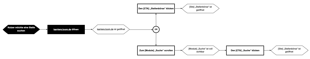
User Flow
We created a simple user flow on how to get to the jobsearch.
Wireframes
To make it the user as easy as possible we showed them a map. On that map we clustered the job vacancies and showed them, where they are in Germany.
When the user hovered over a cluster, we showed them the job vacacies. The vacancies could be filtert, with the filters about. The user also could click on one of the clusteres and the map would zoom in and shows the next level of clusteres.
Also every change in filters or clicking on a cluster has immediate effect on the list under the map.